
The 12 Principles of Animation
A study in applying traditional animation principles to UI motion design
Quick Links
07: ARCS
Arcs are the visual paths of objects and movements. Like squash and stretch, they often go unnoticed, because of how natural they are. Almost everything travels in an arc, with the only exception being machinery and other objects that deliberately have stiff, robotic movements. For the simplest example, we can turn once again to our trusty bouncing ball. Everyday actions all have arcs, such as swinging our arms and legs while walking, turning our head and even the corners of our mouths when smiling. Just find a point on the object or body that is easy to track, such as fingertips, heels and toes, the nose, the end of a tail or a tool, or even knees, and you will begin to see it everywhere. Arcs in animation make movements more believable and realistic.


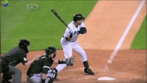

Again, similar to squash and stretch, arcs are not widely utilized in UI design, because of the unnatural elements of the digital environment. Movements don't have to be realistic, as long as they are not disorienting and are consistent with the visual style of the design. Arcs can still add softness and character to a moving element that is subtle but can make a difference. Below, using the previous animation example for the Straight Ahead / Pose to Pose principle, I removed the arc from the moving element in order to compare it to the original version and added a visual motion path so that the arc can clearly be seen.
Further learning and examples:
-
From Animation Mentor's blog: Arc: The 12 Basic Principles of Animation
-
Animated Short Film: Thought of You by Ryan Woodward
08: SECONDARY ACTION
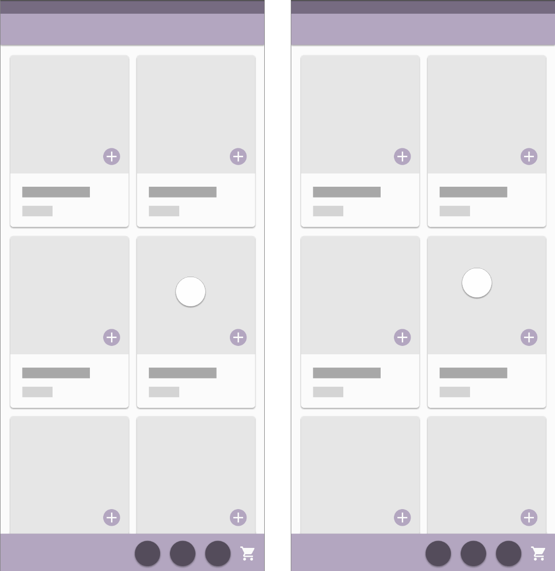
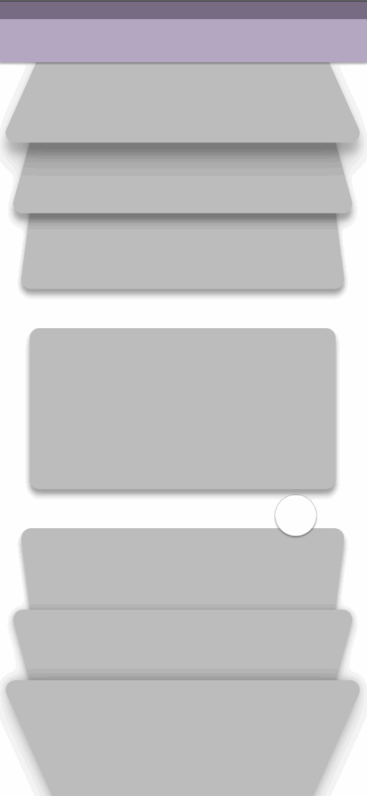
Secondary action is one of the more vague principles that often gets misinterpreted or confused for other principles (such as overlap). It is an action that reinforces the idea or emotion that is being expressed with the main action. It is often seen in dialogues and with props. Someone who is speaking boldly and confidently can betray their anxiety through fiddling with the pen in their hand. Someone trying to look cool or flirty can mess with their hair. Someone who is angrily pacing can make sharp aggressive hand gestures as they shout. Secondary action is meant to be subtle to reinforce and support the main action.


In UI design, this principle can be used to reinforce confirmation of actions taken by the user, such as when adding items to an order. In the example below, the user's eye focuses on the top left card in order to tap the Add icon. They will easily see the checkmark that appears to confirm the action of adding that item to the order. After a small delay, the animation in the bottom right will draw their eye and confirm that the image of the same item was placed in the "bag" and that the number on the bag has changed from 2 to 3. This supported confirmation method tells the user in many ways in a short amount of time that the technology is working for them as expected and gives them a stress-free shopping experience.

Further learning and examples:
-
From Animation Mentor's blog: Secondary Action: the 12 Basic Principles of Animation
09: TIMING
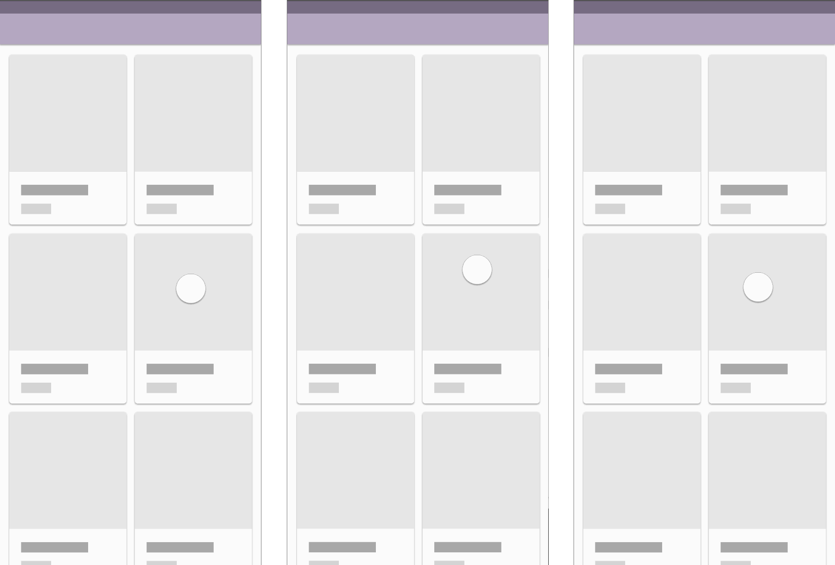
In traditional animation, ideas, emotions and personalities are expressed through how fast and how long characters take to move in contrast with how long they are still - the timing of their movements. It is controlled by the amount of frames (drawings) used to show a movement. Soft, slow actions take more frames to be expressed than fast, snappy ones. It is very similar to slow-in and slow-out, but encompasses the whole duration of the animation, not just the start and end points. Two animations with the same slow-in and slow-out will still feel different if one takes longer to complete. Also like slow-in and slow-out, timing takes a lot of practice to train the eye for nuance in animation. It can take a lot of repetitive iterations, adjusting your work, replaying it over and over to check, making even more adjustments, then replaying it again and again.
In the examples below, I duplicated one of the screens from the Slow-In and Slow-out principle and adjusted the timing of the animations (the easing was untouched). The original screen is in the center, with a deliberately light and airy feel to its animations (imagine a meditation app). The leftmost screen has animations that stretch a bit too long, possibly making the user impatient - not very user-friendly. The rightmost screen has much shorter timing, but nothing moves too fast enough to be jarring or disorienting. The animations are still quite usable, but for an app that would benefit from a slightly snappier visual style and feel.
Further learning:
-
From Animation Mentor's blog: Timing: the 12 Basic Principles of Animation
10: EXAGGERATION
Exaggeration is where animators can have a ton of fun with their work. It adds energy and life (thus, believability) to an animation. Traditionally, animations are filmed at 24 frames per second, so when a single frame of outrageously proportioned characters and objects are inserted into the overall film, the human eye cannot distinguish the individual, exaggerated frame, but the overall energy and feelings will be noticeable. This is especially true when using contrast. The greater the contrast (such as a squashed pose to a stretched one or a resting pose to a fast action pose), the greater the energy. Therefore, while exaggeration is its own principle, it is technically applied to the other 11 principles of animation.
Good exaggeration takes a lot of practice, to train the eye for where it can be used and how much of it. Generally, more exaggeration can be used than is expected, adding the extra "oomph" to an experienced animator's work that a junior's work does not have. Too much of it results in characters that are "over-animated" or "over-acted", sometimes making their bodies look like malleable dough. The right amount of exaggeration is subtle enough that it is unnoticed in the overall animation but strong enough that the general idea or emotion can be felt as a whole.


There are a number of ways to add exaggeration to animations in UI design, usually in order to emphasize one feature over another. For example, using more slow-in than slow-out is exaggeration. It is contrast. It can also be used to add personality and quirkiness to apps designed around a fun style or feeling, such as for children's education. Overshooting is a fun method to use for this, making an element move past its end goal before finally coming to rest. Think of someone getting punched and their face flapping and stretching to the side (like the screenshot of Flynn above), before the flesh and skin settles back into their usual shape, or a child racing to touch a tree but accidentally running past it from extra momentum (they overshoot the tree) and having to turn back to finally touch it. Below, the tabbed screens overshoot and bounce when their specific tab is tapped, giving the app a quirky feel. The other example uses exaggeration for emphasis, letting the user know that more input is required to continue. The shaking of the alert box would not have as much impact if the animations were too subtle to notice.


Further learning and examples:
-
From Animation Mentor's blog: Exaggeration: the 12 Basic Principles of Animation
-
Pinterest board: Never Pause a Disney Movie
-
Buzzfeed article: 19 Disney Movies Paused at Just the Right Moment
11: SOLID DRAWING
This principle is more associated with 2D animation, especially since the 12 Principles were written before computer or 3D animation was invented. It refers to drawing with the form, weight, volume and solidity that three-dimensional matter has in real life, reinforcing believability. Solid drawing comes with having a good foundation in life drawing, using real-life references, so that the artist has a strong
understanding of natural poses and how bones, muscles and fat work together with the laws of physics. Even if they are working in 3D instead of 2D, a good animator will be able to work with any angle or perspective to create clear lines of action and silhouette.
Like some of the other principles, solid drawing's basis in three-dimensionality means that it doesn't really apply so much to UI design, since it is more common in this field to use 2D elements that are not based on real-life objects, making solid drawing unnecessary. However, also similarly to those other principles, solid drawing can still be useful in cases where realism is being sought. Properties like light, shadows, layering and perspective are important in creating a sense of solidity and a physical relationship with other objects.
Further learning and examples:
-
From Animation Mentor's blog: Solid Drawing: the 12 Principles of Animation
12: APPEAL
This final principle is the culmination of all the other principles and possibly the most important. While animators attempt to create believability (the illusion of life, so to speak) by referencing real life, appeal is what makes animations interesting to look at. If too much focus is placed on reality, appeal can be overlooked. A video of a bouncing ball may be realistic, but an animation of a bouncing ball with exaggerated squash and stretch will be more interesting. It all comes down to the idea, emotion or personality that is trying to be expressed in the animation.

Likewise in UI design, appeal and all of the other principles are dependent on the purpose and intended audience of the product, what will ultimately determine its visual style and feel. All of the animations within the product should be consistent with that style while maintaining usability - elements should not be too fast as to be jarring/disorienting or too slow as to cause impatience.
Further learning and examples:
-
From Animation Mentor's blog: Appeal: the 12 Basic Principles of Animation
FOR READING!
Thanks
View more case studies below:

