
The 12 Principles of Animation
A study in applying traditional animation principles to UI motion design
Overview
RESPONSIBILITIES
Project Management
Research
Low-Fidelity Design
Micro-Interactions / Animations
TOOLS
InVision Studio
TIMELINE
Apr 2019
INTRODUCTION
With a background in animation, I wanted to explore how that particular experience could be used in designing motion in user interfaces. The 12 Principles of Animation were first published by the legendary Disney animators Frank Thomas and Ollie Johnston in their book, The Illusion of Life: Disney Animation, based on the work of leading Disney animators since the 1930s. These principles have been the foundation of every animator's skills for decades, whether they work in traditional animation, computer-generated, 3D, claymation, film, television or video games. Today the 12 Principles of Animation can still be applied to motion in a wide variety of creative fields, including UI design. I wanted to break down each principle (in the order established by Frank and Ollie) and provide examples of how it can be applied in this age of mobile-centric design.
Read Frank and Ollie's explanation of each principle here.
PROJECT TYPE
self-motivated exercise
Quick Links
01: SQUASH and STRETCH
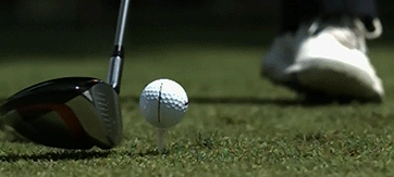
Arguably the most important principle in the traditional animator's toolkit is squash and stretch, in which contrasting shapes are used to express weight and volume. This idea is commonly exemplified in the bouncing ball, where it squashes when in contact with the ground due to gravity and momentum from hitting it and stretches from the momentum of moving through the air. The image below shows the difference in frames of a moving ball using no squash and stretch (on the left) and a ball using squash and stretch (on the right). Each frame may look odd in isolation, but when put together in motion, the squash and stretch makes the animation look more believable and realistically grounded in physics.

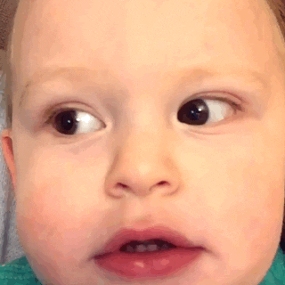
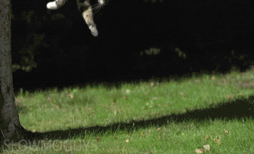
While it's often not easily recognized, regular every day objects all display squash and stretch to some degree, depending on qualities like their material make-up and the kinds of forces being exerted on them, such as drag or momentum. Fleshy creatures are particularly susceptible to this principle due to, well, our flesh and its elasticity, which means that utilizing squash and stretch in character animation greatly enhances believability. Smiling stretches our mouths horizontally, which then squashes our cheeks upwards towards our eyes due to how our facial muscles are attached. Expressions of horror will vertically stretch out our eyes, cheeks and jaws. A cat's body will stretch on its way down from a jump before squashing upon landing on the ground to absorb impact. All of these objects have volume, which affects and is affected by other objects and forces around them. It's often easier to view the squash and stretch principle in effect via slow-motion.
In contrast to traditional animation, squash and stretch is not widely utilized in UI design, often because we are not necessarily working with physical objects or trying to display elements that are grounded in reality, which would require the expression of weight and volume. However, some design systems and philosophies deliberately try to apply real physical attributes to digital elements (such as Google's Material Design), and it is in these cases where the squash and stretch principle's roots in weight and volume can be utilized - to express how UI elements can take up and manipulate space within the canvas (the device screen). One example is when tapping on a card to expand it and reveal more information. The card grows in volume, which pushes away the other cards around it in order to make space for its growth. An app using this sort of design system would use scaling and a slide or push transition for this instead of a fade or dissolve.
Further learning and examples:
-
From Animation Mentor's blog: Squash and Stretch: The 12 Basic Principles of Animation
-
Video Playlist: Various Types of Balls Bouncing in Slow-Motion
02: ANTICIPATION
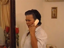
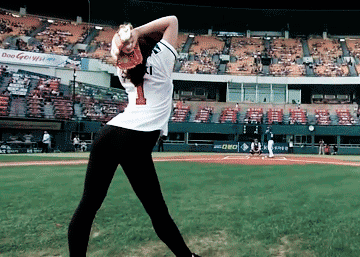
Anticipation is the action (often, but not always, the opposite one) that precedes the main action of an animation. It prepares the viewer for what's about to happen next. Again, this is usually explained through the motion of a bouncing ball, in which the ball squashes down onto the ground before popping up into the air. That squash is the anticipation for the upward movement. If you look closely at the gif below, the squash is even preceded by a tiny anticipatory stretch. A more practical example can be found in baseball - the pitcher will pull her arm backwards (the anticipation) before throwing the ball forward (the main action). In the gif below, you could even say that not just her arm but her entire fancy wind-up is the anticipation.
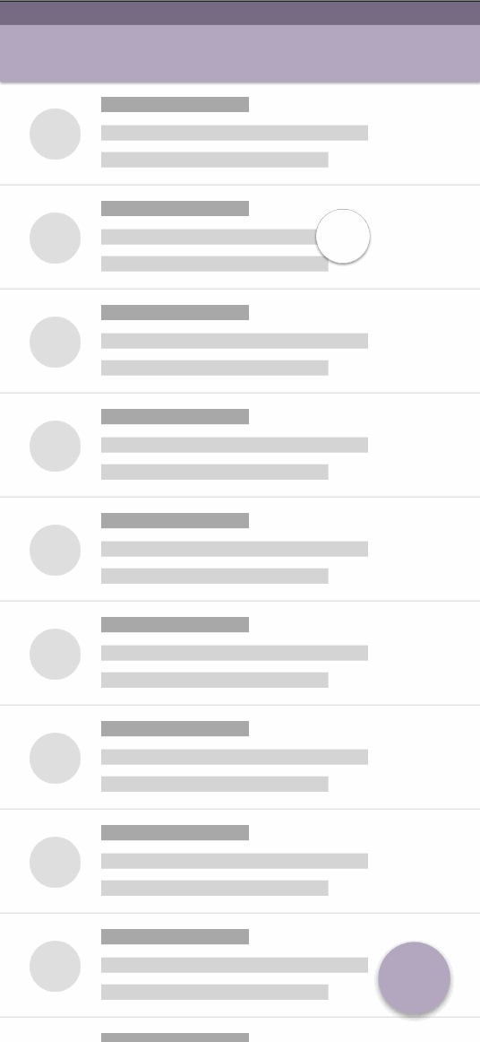
This principle can be used in UI design to help users explore and discover features and functions of the app, especially those that are initially hidden. A common example of anticipation in modern mobile designs utilizes the drag function. When a user starts to pull elements in a certain direction, hints can be shown in order to prepare and show the user what completing that action will do. Below, as the user drags across the screen, they start to see peeks of both color and familiar iconography to let them anticipate what will happen if they finish dragging those elements. Revealing the icons early on (such as near the edges of the screen in the horizontal drags) before animating towards their final position (near the center of the card) allows the user to process these functions earlier and more quickly than if the icons were already centered (meaning the user won't see them until they've already almost finished dragging the element). The color change tells them there is something new/different going on, but the icon tells them what that thing specifically is.
Further learning and examples:
-
From Animation Mentor's blog: Anticipation: the 12 Basic Principles of Animation
03: STAGING
Staging in cinematography is about clearly communicating moods and/or ideas through the use of camera angles, framing, strategic placement of characters and objects in a setting, consistent screen direction and lines of focus. It is about controlling the audience's eye and attention. John Nguyen explains many of these techniques very well using examples from the Star Wars franchise in his Staging article for Animation Mentor.


Likewise in UI design, staging is utilized for the goal of controlling the user's eye and attention. It is important to arrange content logically and in a way that would not confuse the user, improving usablility. The example below shows an app with tab navigation. Similar to how characters in a dialogue should always be framed on a consistent side (ie. character A is always seen standing on the left and character B on the right), the screen transitions should coincide with the location of their corresponding tab. It is expected that clicking on the leftmost tab should cause that screen to appear from the left. If it animated onscreen from the right or the bottom, it would be disorienting. Likewise, dragging from left to right should make the screen begin to transition from the left. Additionally, the colored indicator below the active tab moves left and right according to the direction of the animation, further reinforcing and orienting the user of their current location within the app.
Further learning:
-
Video: Film Blocking Tutorial
-
From Animation Mentor's blog: Staging: the 12 Basic Principles of Animation
04: STRAIGHT AHEAD and POSE TO POSE
These two techniques come from the age of hand-drawn animation, in which each frame is drawn on a single piece of paper (think of flipbook animations.) Straight Ahead animation involves drawing each pose one after the other without skipping ahead until you go from point A to point B. It is most often used for fast, wild, chaotic movements, because the poses arrive at point B organically and sometimes unpredictably. Pose to Pose animation allows for much more planning and organization, because both point A and point B are drawn first, then the halfway pose between them, and so on. Key drawings (or frames) are used throughout the animation in order to ensure the proper ideas are hit (the first and last drawings are also key frames), and the rest is filled in between each key frame. It is easier to maintain and control proportions with Pose to Pose, and it is the most common type of method used, including in modern CG animation. Computer animation software automatically calculates the in-between poses for each key frame created by the animator.
In the image below, an animator using the Straight Ahead method would draw each of these poses one after the other in sequence (Contact > Down > Pass > Up > Contact). Drawing with Pose to Pose would look more like this: (Contact > Contact > Pass > Down > Up). Of course, these are just the key frame drawings, so in order to smooth out this walk animation, in-betweens would be filled in afterwards no matter which method was used.

Just as modern CG software has enabled easy use of the Pose to Pose method for character animation, many modern UI design and prototyping software helps us animate our UI designs with varying amounts of control depending on the software. Generally, we set the start and end points, and the software calculates the in-betweens for us. Changing the shape of an element is a fun way to showcase the start and end points of an animation.
Further learning and examples:
-
From Animation Mentor's blog: Straight Ahead Action and Pose to Pose: the 12 Basic Principles of Animation
-
Video: Straight Ahead & Pose to Pose - 12 Principles of Animation
05: FOLLOW-THROUGH and OVERLAP
This is another principle that is grounded in physics and utilized to make animations look more realistic and believable. It is based on Newton's Law that objects at rest want to stay at rest, and objects in motion want to stay in motion. Follow-through and overlap are applied to objects that are auxiliary to the main body or action, such as clothing, hair, long ears and tails, etc. When the body stops moving, the other objects want to keep going (follow-through), coming to rest with the main body a few frames later. When a moving body changes direction, the other objects want to keep moving in that initial direction (overlap), catching up to the main body a few frames later.
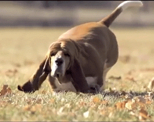
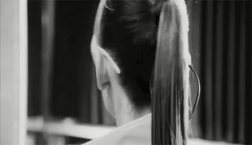
In the gifs below, as the dog's head moves up, its ears seem to straighten (stretch down) and drag before popping upwards after the head. As its head moves down again, the ears seem to hang in the air a bit longer (a little bit like a parachute opening) before beginning to fall down. Next, the woman finishes spinning her head before her ponytail catches up. You can see it overshooting to the left before settling forward to finish the spin (hitting her jacket collar). Finally, limbs can also be auxiliary objects to the main body's movements, as exemplified by the pitcher's arm continuing to move downward and back, even after his torso has finished twisting for the throw.
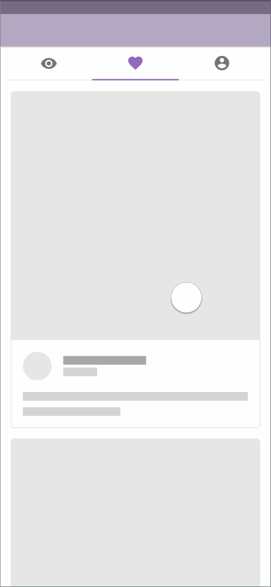
In UI design, transitioning with the stagger effect mimics the drag that a main element would cause for its secondary elements. In the example below, the event card pops up with the main image leading the animation and the rest of the information following with delayed timing.
Further learning and examples:
-
From Animation Mentor's blog: Follow-through and Overlapping Action: the 12 Basic Principles of Animation
06: SLOW-IN and SLOW-OUT
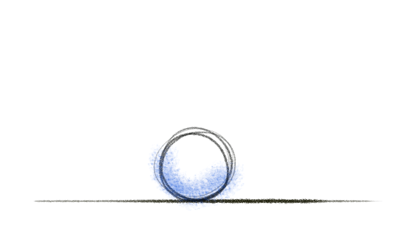
This principle is all about the speed of an action, especially how it begins and ends. It is also often called "ease-in and ease-out". In terms of traditional animation, the more frames there are, the slower and softer the movement will feel, and the less frames there are, the faster and snappier it will feel. The idea is that real life objects don't have a constant speed when moving. A car stopped at a traffic light can't immediately start moving at 60mph once the light turns green. It must build up to it. Likewise it must slow down again to stop at a red light, because moving from 60mph to a dead stop is impossible.
Slow-in and slow-out can be explained through curves (or lack thereof) relative to time and whatever aspect is being animated/changed (ie. size, shape, color, opacity, distance moved, etc). In the examples below, the shapes begin and end changing at the exact same time, but the speed variations at which the changes take place are different depending on the type of ease. A linear line shows no slow-in or slow-out at all, which results in unrealistic, stiff, robotic movements. Next, the S curve shows both slow-in and slow-out. You can see that there is very little change at the beginning of the animation, but as time moves towards the middle of the curve, the change becomes much more rapid, until slowing down and petering out again near the end. Adjusting the arcs of the S curve will adjust the timing of the change, which can result in other combinations, such as slow-in with little to no slow-out or vice versa. Again, you can imagine these movements as a car going from a red light to another red light with varying (sometimes unrealistic/impossible) speeds.
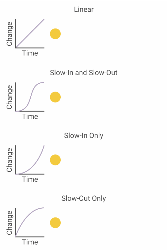
A lot of nuance and fine tuning goes into the practice of slow-in and slow-out, again making it one of the most important principles for an animator to master. Using too much or too little of one, the other or both can have drastically different effects. Movements that are too slow can make the user impatient, and movements that are too fast can be disorienting or unregistered. The style and tone of the app also plays an important part in determining the general speed of the animations for the app. A meditation app will want softer, more friendly animations, whereas a task-managing app will probably want practical, steady, unobtrusive animations. Below are examples of a card opening in two different styles: soft with both slow-in and slow-out and snappy with emphasis on slow-in.
Further learning and examples:
-
From the I Want to Be and Animator blog: Slow In and Slow Out